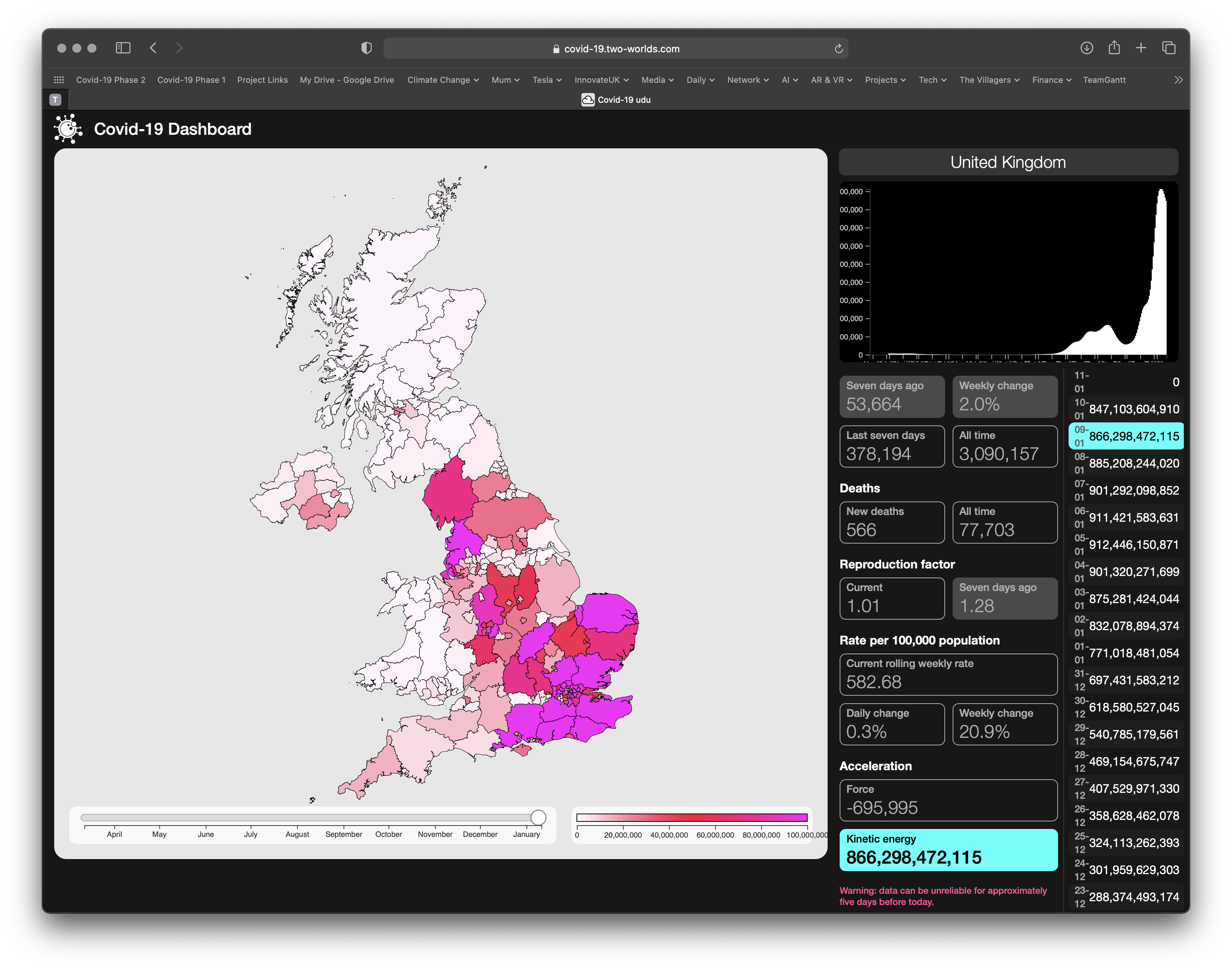
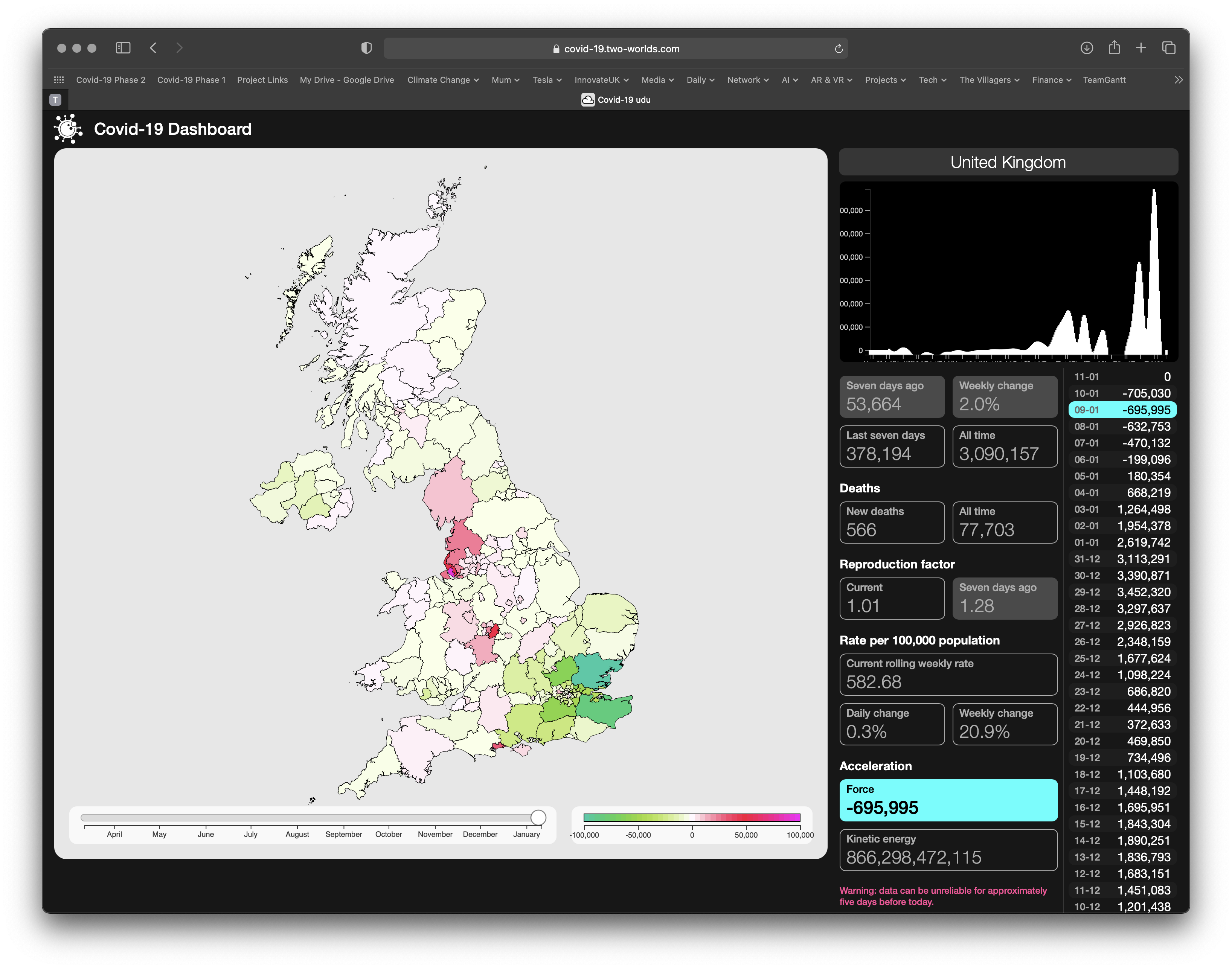
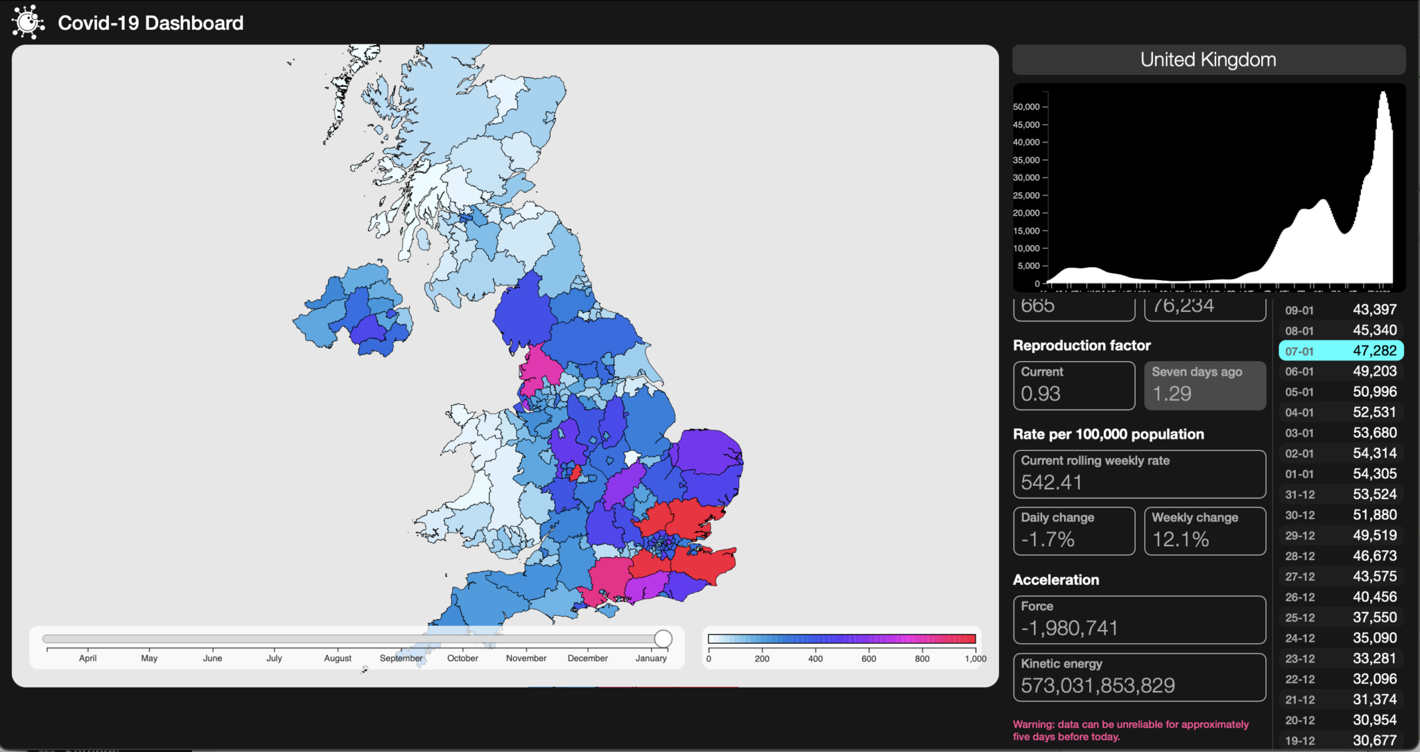
We\’ve been thinking for some time about how best to present the dynamic of the pandemic in a way that actually shows what\’s happening – the R number doesn\’t give any idea of magnitude and is – in our opinion – best kept behind the scenes as a contributor to analytic models, raw or compensated case numbers are just that – daily records – shocking enough in themselves but they still don\’t show the energy in the thing.
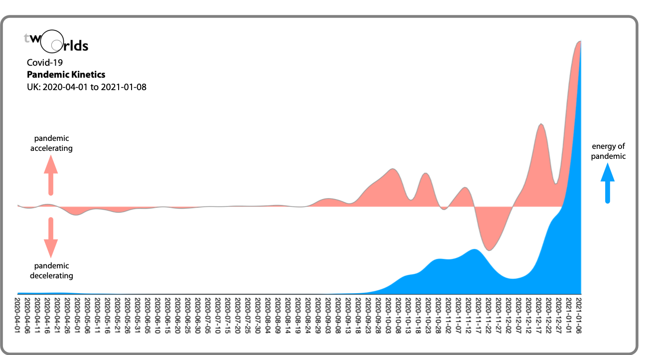
Which is the point: this is a dynamic system with both momentum from existing infections and where rising (or falling) infection rates cause case rate to accelerate or decelerate. So we brushed up on our Newtonian physics and used his first and second Laws of Motion to calculate the momentum and its force – the acceleration or deceleration of the pandemic – at any time.
So the graph below shows the energy (blue) and acceleration (pink) of the pandemic across the UK from 1st April 2020. The equivalent maps show that, while the pandemic is decelerating in the South-East (and accelerating slightly in the NW and Scotland), the level of energy in the SE is still huge (and effectively off the scale relative to the first wave in March-May, showing that it would take very little for the pandemic to start to turn up again)


When we started experimenting with this approach, we expected something. We didn\’t quite expect such a dramatic visualisation, especially one that subjectively feels to have a strong correlation with real world impact, hopefully bringing that home for non-experts, and at a visceral level. Remember here that the UK currently has about the world\’s highest case rate – well ahead per capita of the USA.
We\’ve been over our methodology and believe that we\’re calculating both reasonably and accurately.
Development of Two Worlds’ analytic platform for the Covid-19 pandemic is supported by InnovateUK under R&D grants 54368 and 93341.


Pingback: Lagging Decisions, Big Consequences? | Two Worlds: Intelligent Reality