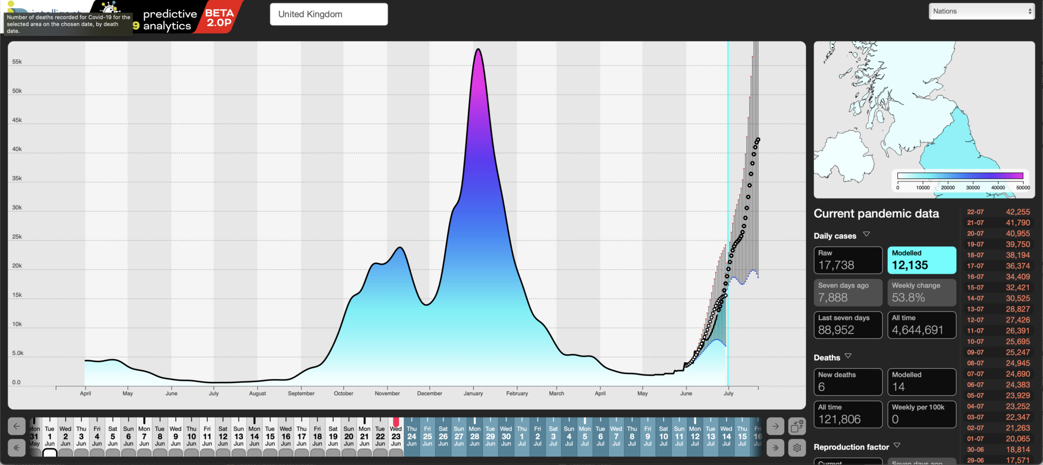
Taking the current rise in infections as an example, our analytic system has, consistently been able to forecast changes in the Covid-19 pandemic across the UK – we started with 14-day forecasts and have now pushed those out to 28 days. We made that change as we improved our algorithms, validated our earlier forecasts and, of course, as our system has had more historical data to work with, it\’s got somewhat better at its job.
To validate the forecasts, we measure their daily predictions against what subsequently transpired – these can be displayed in our dashboard by clicking the grey tabs below each date in the horizontal date picker at the bottom.
For that period then, we have forty four 28-day hindcasts, plus the current forecast, from 24 June (today being the 30th – the lag is down to the rolling evolution of data quality for recent days).
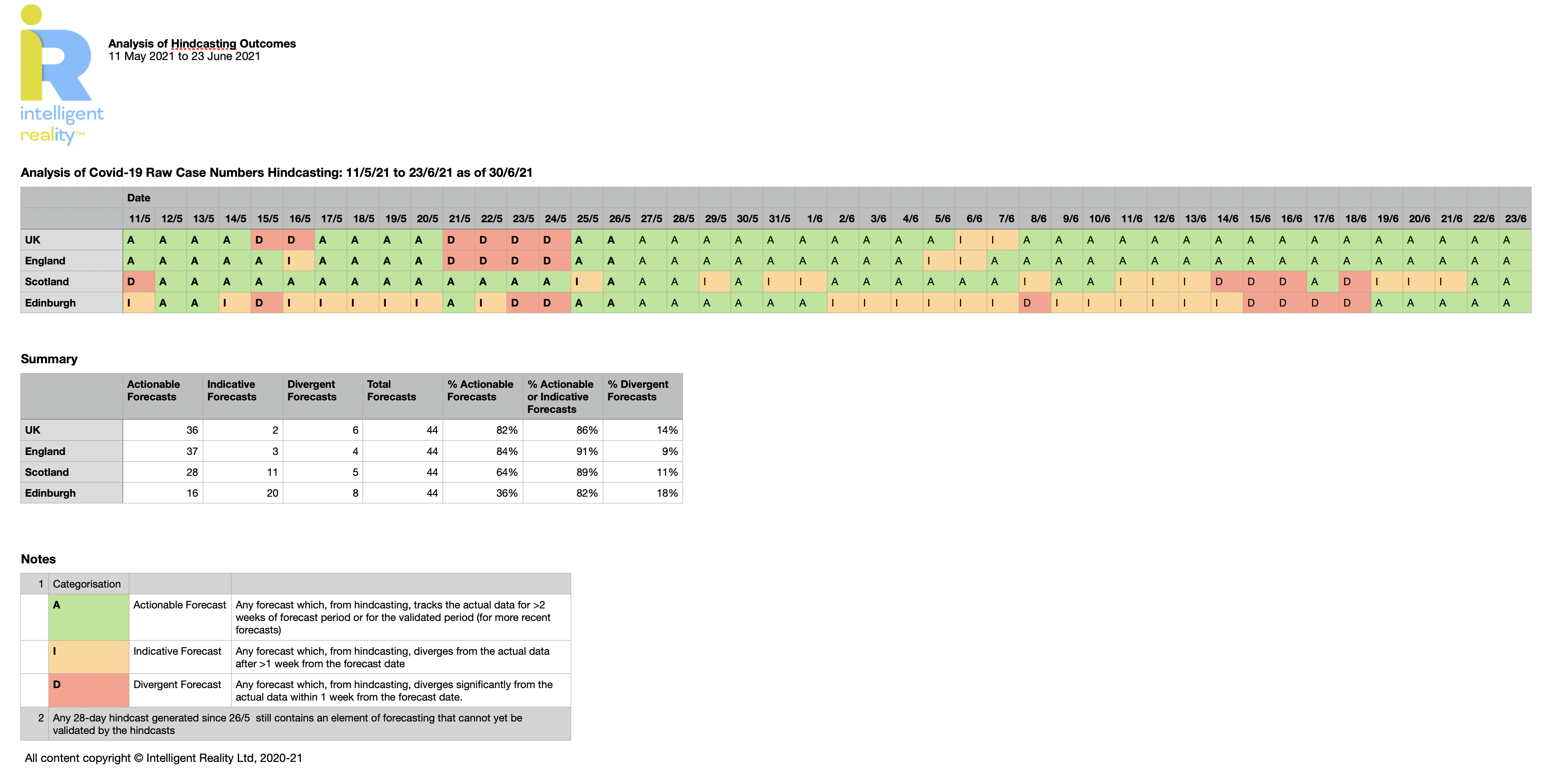
For the UK, on thirty six of those forty four days, our forecasts generated a trajectory that closely matches the subsequently recorded change in case numbers, by which we mean effectively tracked the actual case numbers for at least two weeks into the 28-day forecast. We call those Actionable forecasts, in that they\’ve proven accurate enough to confidently have taken policy decisions against.
Our header image shows the current forecast for the UK, overlaid with our hindcast for our forecast from 1 June. We think that speaks for itself.
On two days (6 & 7 June), our forecasts diverged between one and two weeks after the forecast date (we describe those as Indicative forecasts) and, on six days (15, 16 and 21…24 May), our forecasts diverged from the actual outcomes either immediately or within one week of the forecast start date. Those we call Divergent forecasts.
Of course you don\’t know in advance which forecasts are going to prove reliable, but that doesn\’t stop us taking a jacket if the weather forecast tells us it\’s likely to rain tomorrow. The bottom line is that, taking the timeline from 11 May (chosen to examine the quality of our forecasting against the current wave), we have generated actionable forecasts over 28 days 82% of the time and forecasts that were Actionable or Indicative 86% of the time. As you\’d expect from any forecast, the shorter the outlook, the closer we\’ve been to what subsequently transpired.
That\’s for the UK as whole. You might also expect that, the bigger the population and the more case data we have, the more accurate should be the forecasts. The interesting part is that we see a higher level of Actionable forecasting (84%) for England alone than we do for the UK as a whole (82%). We attribute that to there likely being significant differences in both the progression of the pandemic between the four nations and the quality of local forecasts due to lower data density. In a future development, we are planning to include correlation of pandemic outcomes and progress against government policies in each area, in order to look for demonstrable differences in the impact of government policy for each country.
Once we get to a local level, we see that the level of Actionable forecasts plummets, but that the percentage of forecasts that are Actionable or Indicative holds up well. Here, we\’ve used Edinburgh as an example where, during the period, 36% were considered Actionable, but 82% were either Actionable or Indicative, with 18% then disappearing off into the fantasy realm of Divergent forecasts.
These outcomes are summarised in Figure 2 below (click to enlarge).

The lesson there is that the local data should always be used with more caution when planning responses than the national data, and that\’s as true of the raw published data as it is of our forecasts and analytics. We do carry out data fitting as part of our analytics, which helps smooth out reporting variations over time, which does help, especially at local authority levels.
Conclusions:
Our conclusion then is that the class of emergent forecasting we have developed and tested over the last year can provide actionable and justifiable input into policy making for the pandemic and, if adopted, could have accelerated policy responses at most stages of the pandemic, in some cases by up to a month. Persuading policy makers to act on the data is another matter entirely.
Methodology:
Our forecasts always run from six days behind present, as case data by actual test data lags by 48 hours and data quality for a rolling five days before that is highly to somewhat unreliable. After that, it achieves a semblance of stability.
Hindcasts are therefore not just the stored forecasts made on any given day: they are recalculated daily, to reflect the evolution of the source data, so that they always show what we would have forecast, given the best currently available data for a given date.
Usage:
This isn\’t about prescriptively making policy calls from the data, it\’s about supporting policy judgement with timely insight and foresight using modern analytic and predictive techniques. For instance, given that we\’re now probably seeing a strong degree of decoupling between cases and hospitalisations and deaths, we are in a different decision regime. Whilst our system can easily incorporate that in our analytics, and thereby provide a wider spread of decision support metrics, we don\’t currently have the resources to do so, much as we\’d love to.
About us: Intelligent Reality is a data intelligence company, using emergent approaches and inferential AI to provide daily analyses and forecasts for Covid-19, currently for the UK. We’re based in Scotland and Germany, and supported by the udu team in the USA. Together we have brought together a highly experienced team of data scientists, designers and epidemiologists to address some of the key problems we’ve seen with the generation and use of pandemic data to support decision making for public policy.

