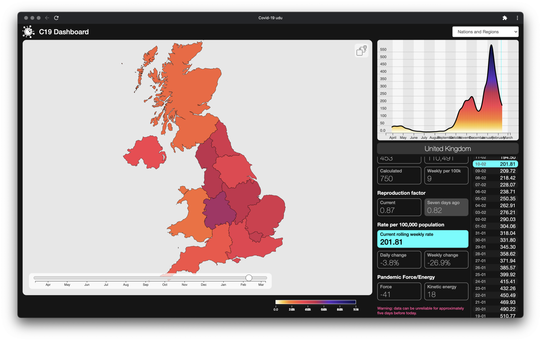
There\’s been a lot of covoptimism this past week, from assorted government spokesfolks, including from people who do know what they\’re talking about – a prime example being Prof. Neil Ferguson of Imperial. The theme here is that cases, case rates and the R number have been falling strongly and appear to be continuing to do so.
That’s true, to a point. But our modelling suggests that the immediate future is less rosy.
It\’s not about the data – we use the same published sources as the government, albeit that they\’ve got access to more sources than we do – it\’s more about what you do with it.
Long story short(ish): the official figures appear to be produced from the collated raw data on a weekly basis, with analytics and forecasts produced from there. They use what we\’d summarise as hypothesis-based modelling, where you work out how you think the world works, create a mathematical and statistical model that you hope explains it, then push data through the model and see how well it aligns with what actually happens. You then refine and repeat until you hopefully start producing results that match reality.
So the outcomes tend to be assumptive (as they\’re based on a model), require a deal of rebuilding to incorporate new data sources, and are computationally intensive.
We however use an emergent approach, where our analytics are driven by the data, without making a priori assumptions about mechanisms: we generate core metrics from the entire data series and use that to drive both analytic indicators of where we are and projections of where we think things are going.
There are pros and cons to both approaches, but an advantage that we have is that we can produce national, regional and local analyses on a daily basis, using the latest available data: where that is of poor quality (which it usually is for up to a week after release), we have developed a mathematical model to compensate for reporting variability, thereafter driving our analytics from the compensated data.
We\’ve already identified occasions where lockdown decisions have been apparently made on lagging data. In most cases, those have been a case of doing too little, too late, but we have tracked one case recently (Na h-Eileanan Siar) of too much, too late, where lockdown was moved from Tier 3 to Tier 4, some time after the data showed that the peak of the problem had passed.
Back to this week: Neil Ferguson told told Politico’s Westminster Insider podcast (as reported by The Guardian):
“The lockdown has really driven down cases quite fast. They’re basically halving about every 17 days at the moment or so, and that means in a month’s time – the prime minister’s talked about potentially reopening schools – we might have some bandwidth to do that, at least primary schools.\”
“And if we continue to see then a continued decline without large outbreaks, then perhaps starting to relax other aspects of society the following month.”
It\’s important to note here that he\’s not saying that we can relax restrictions immediately, despite the fact that some politicians seem to be taking this trend as license to argue to do so.
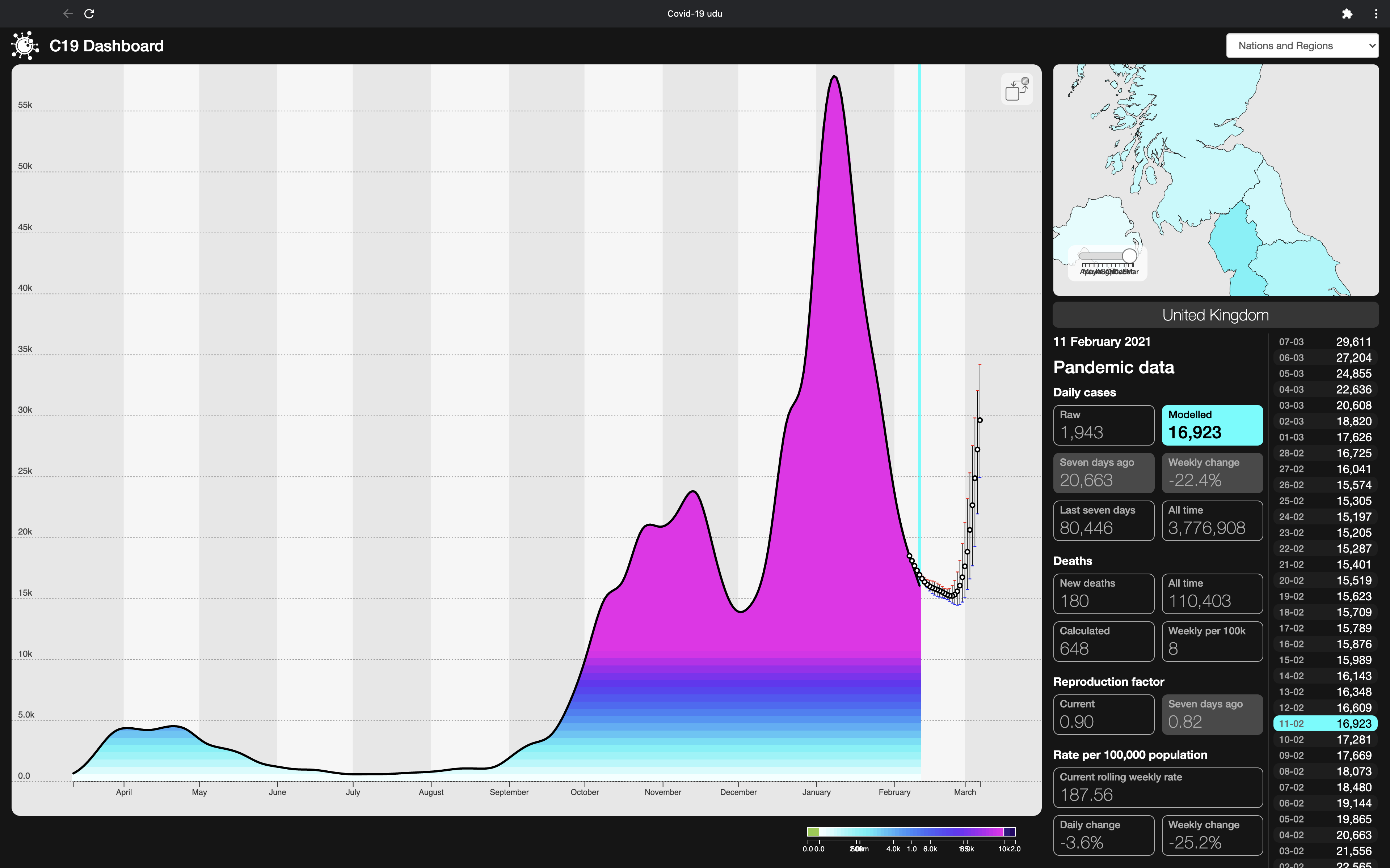
Which is just as well, if our forecasting is even remotely correct. Our modelled figures for the current state of new cases show exactly what Prof. Ferguson is describing – a halving of daily new cases between 24 January and 11 February and, before that, a halving from the new cases peak on 8 January in the 20 days to the 28th.
So far, we\’re all pretty much in agreement.
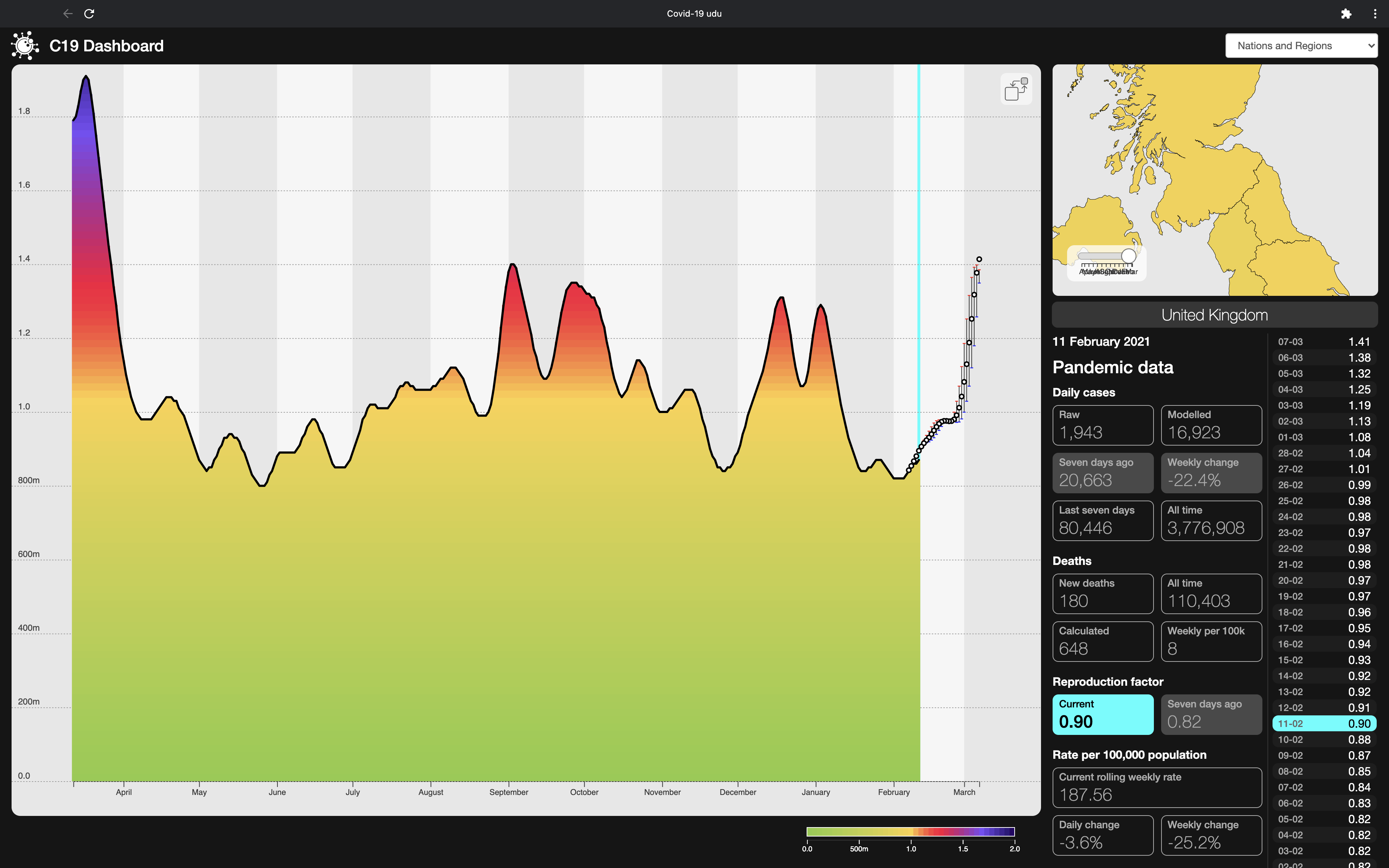
Where we do differ slightly is in our R number calculations: the UK’s official R number range published as of 12 February (we’re not sure which days contributed to that calculation) is .7 to .9. Our own regional calculations from the data published on the 12 February give a UK figure of 0.9, and a regional range from 0.82 (South-West and East of England) to 1.0 (Wales). That’s against a background of its having been consistently below 1 since 11 January, rising now from its recent low of .82 on 5 February.
Given that, and even without forecasting, we expect to see a coming rise in case numbers.
Now we move from historical analysis to forecasting. Firstly, some caveats: since we first started getting results from our forecasting analytics in August/September 2020, we’ve been using a fourteen day outlook, something which, for any area for which there is a significant number of cases, has proven generally robust and accurate, and better than our own expectations. It also has, in line with expectation, become more accurate as the pandemic has gone on, simply because the time series has more inherent diversity and complexity.
If we were to look at only our case number forecasts under our fourteen day model, we’d be seeing a continuing fall in case numbers, although we’d be expecting to see a rise in cases thereafter, given the rising R number.
We have however recently moved to a 28-day outlook and, whilst validating that time period through hindcasting (picking an arbitrary date in the past, running our forecasts from that date and comparing the forecast outcomes with what actually happened) has demonstrated surprisingly close fits in many cases, we haven’t yet finished calculating our uncertainty measures. And do remember that we’re forecasting in a complex, multivariate environment, where long-term covid forecasts are likely little more useful than weather forecasting over the same period: helpful indicators of trend, but not to be relied on for specific daily detail.
Our focus right now is on working out just how far out we can go and still provide forecasts where a usefully significant proportion is within actionable limits for decision making.
WIth that in mind, our 28-day forecasting is now showing, for every region in the UK, that the number of new cases is continuing to fall, albeit at a reducing rate, until around 24 January, but turning up sharply after that. We\’d expect this even without the longer forecast, on the back of an already rising R number, which our forecast suggest will cross the critical 1 barrier for the whole UK around the 27th of February. with daily new cases returning to late January levels during the first week in March.
We are also now using some initial compensation for the new variants spreading across the UK, the so-called Kent (B1.1.7) variant in particular, and we have noticed that this does close much of the gap we\’d earlier seen between our forecasts and delivered reality, where we’d noticed that our forecasts had started undershooting the actual figures.
If our forecasts are even remotely correct, they argue against any near-term relaxation in restrictions. In particular, they suggest that the mooted re-opening schools on or around the 8th March may risk further accelerating already upward-bound case numbers.
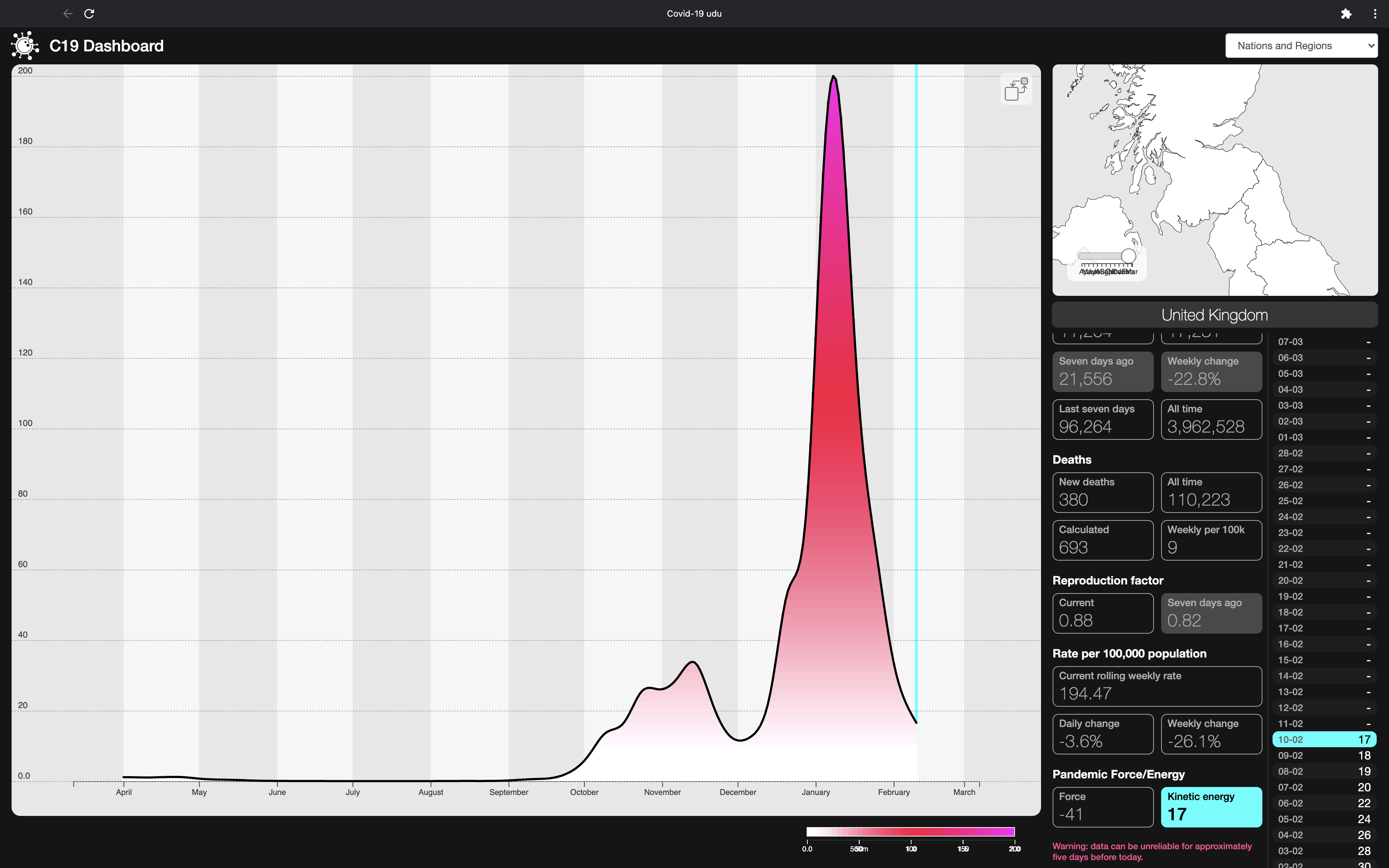
Moving on then to our Kinetic Modelling of the pandemic, we’re seeing that, while the pandemic’s momentum has dropped dramatically since it peaked on 8 January, it’s still only back to where it was as of 12 December, and far above the peak of the first wave. In terms of its rate of change, the pandemic’s force is still decelerating, and has been since 9 January, but the rate at which it is decelerating is dropping rapidly.
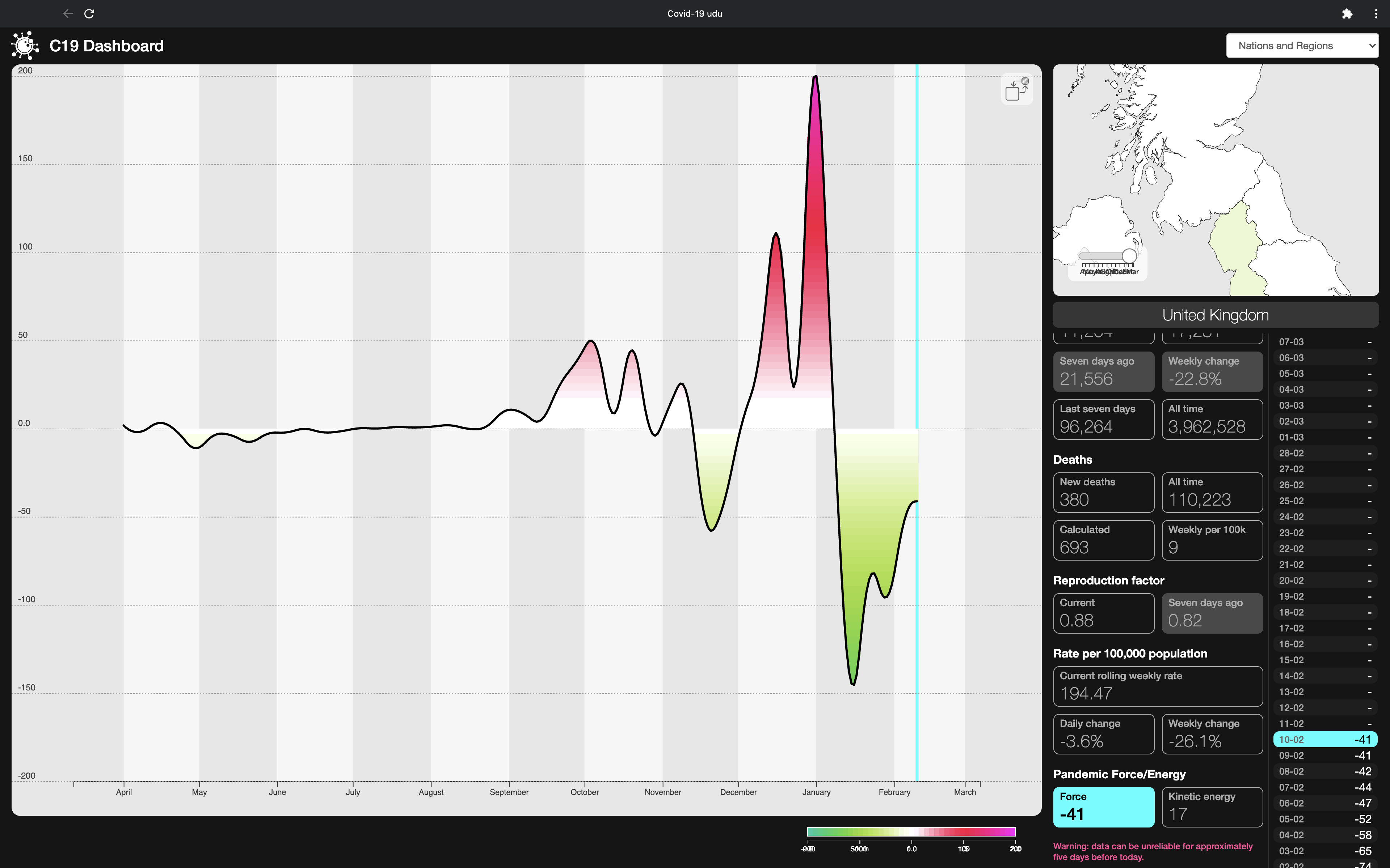
We will of course find out over the next couple of weeks whether our forecasting is actionably close to reality or whether we need to refine our approach further for the longer outlook.
Development of Two Worlds’ adaptive analytic platform for the Covid-19 pandemic is supported by InnovateUK under R&D grants 54368 and 93341.

